I’m excited to share some significant updates that we believe will enhance your experience and streamline your development processes even further. Today, we are launching a new backend dashboard and our brand-new backend documentation platform!
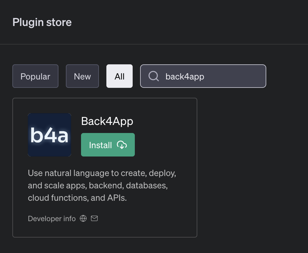
In the software development world, creating a scalable backend with APIs has traditionally been a task reserved for skilled developers, often requiring hours of complex coding. But what if there was a way to streamline this process using the power of conversation?
That’s where the newly built Back4app ChatGPT plugin comes in! The plugin was created to transform the way backends are developed. No longer will you need to wade through intricate codes or wrestle with confusing configurations. With this plugin, you can simply tell ChatGPT what you’d like to create using natural everyday language, and it’ll build a fully functional, and scalable backend with APIs.
So whether you’re a startup looking to build a new software or application, an experienced developer, or just getting started and have a great idea, the Back4app ChatGPT plugin will give you an unprecedented level of accessibility and efficiency.
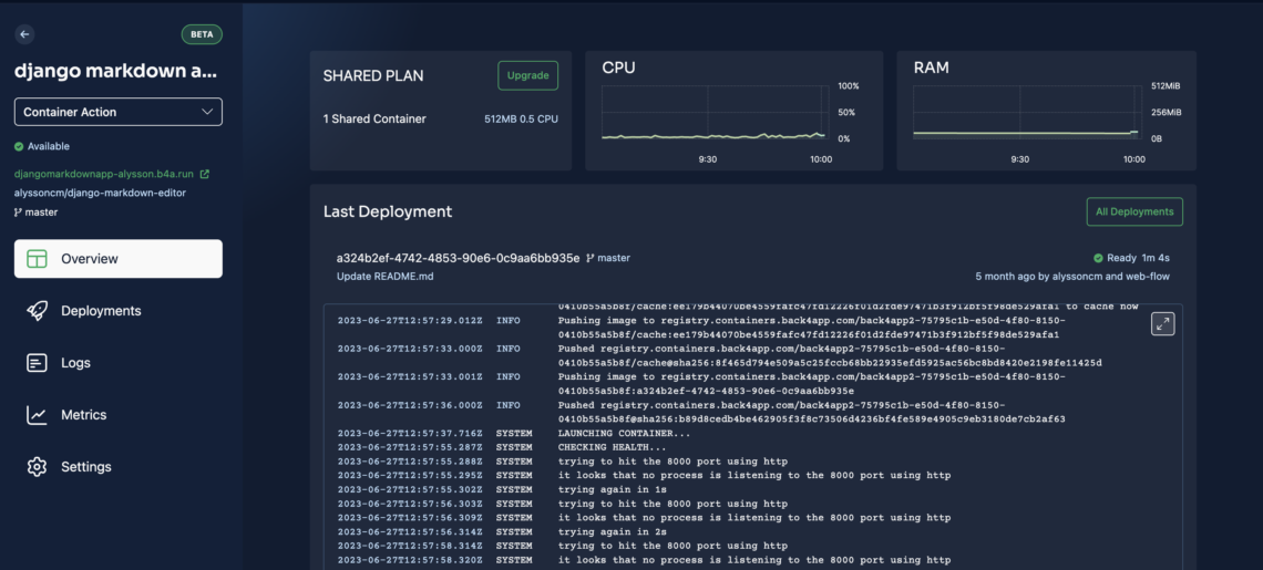
We are excited to share some significant updates to our Containers platform that aim to improve your user experience, streamline your work, and boost the performance of your applications.
Flutter and Dart are two major app development technologies endorsed by Google.
Generally, Dart is a cross-platform programming language, while Flutter is a UI SDK. However, developers and businesses want to explore Flutter vs Dart in detail.
Therefore, this guide will share the key differences and similarities between these dev technologies. Besides, we are going to talk about their advantages, features, and disadvantages.
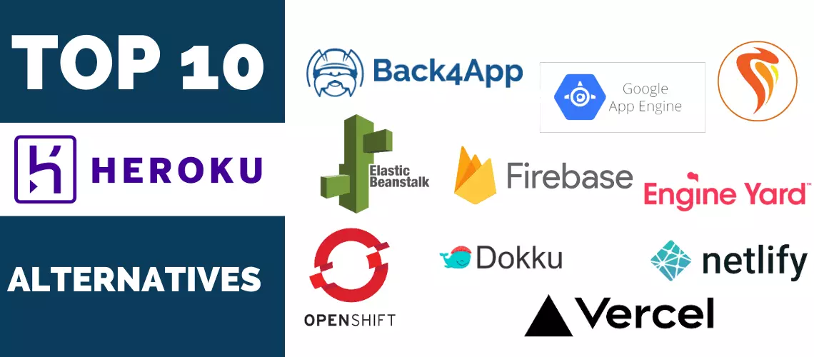
Are you looking for the best Heroku alternatives in 2024?
You are on the right place and this comprehensive tutorial will guide you about the best Heroku alternatives and cover competitors like Back4App, Render, Railway, and many more.
The article will first provide an overview of Heroku and highlight why users are looking for alternatives to Heroku.
Subsequently, this article will explore each Heroku alternative individually, covering the core features, pricing structure, and reviews.
In this article, you’ll learn everything you need to know to get started with Remix. We’ll look at its pros and cons, demonstrate how to build a Remix app, and lastly, how to deploy Remix.
The consumption of mobile applications has grown in the past few years. That is why the smartphone application market has gained big numbers in terms of earnings.
A Statista report projects that mobile app revenues will hit 673 billion USD by 2027. This number was 254 billion USD in 2019. It signifies mobile app development is highly beneficial.
However, without a high-performing mobile app backend hosting provider, it will not be an easy job for you. So, this article will discuss the best backend hosting services for mobile apps in detail.
The section of an app or website communicated with the end user refers to the client side. Similarly, the part of a site or app that deals with server-side operations is called backend.
Choosing the correct backend for your frontend is crucial. Mainly, if you use the React library for frontend operations, employing a suitable backend for React will be a daunting task.
React is basically a JS library utilized to craft native, highly interactive, and scalable UIs in the breeze.
Founded in 2013, React uses a declarative and component-centric approach to design user interfaces. Moreover, this open-source library has 45.1k repository forks and 221k stars on GitHub.
Contrarily, if we talk about its market dominance among the popular JavaScript libraries, it holds a 4.5% share and 5.6% usage percentage, according to W3Techs.
Correspondingly, a survey by Statista claims that React is the 2nd most used web framework with 40.58% votes.
So, it is essential to choose the best backend for React that doubles the chances of success for your project. So, this article will discuss the types of React backends and the top solutions.
Nuxt.js is an open-source framework made on top of Vue.js, Nitro, and Vite, which allows you to develop web apps.
Inspired by Next.js (a React framework for Server Side Rendering), Nuxt.js enables developers to craft fast web applications by applying different rendering modes.
Released in 2016, Nuxt.js has gained wide acceptance among developers due to its developer-friendly philosophy and rich features.
When building web applications, user authentication is a necessary feature to add to your application. User authentication allows verified users to access features that are available to them in your application and denies unverified users access.
Integrating user authentication in React applications is no easy task and is time-consuming since it involves several complex processes, such as hashing passwords, generating and managing authentication tokens, and many more.
However, with platforms like Back4App, integrating user authentication with your React applications is simple and easy. In this article, you’ll explore how to add user authentication to your React app using Back4App.
Smartphones and mobile applications have become an indispensable segment of our lives. Recent statistics claim that an individual spends approximately 4.37 hours/day utilizing smartphone applications. In the United States, this figure is 3 hours and 54.8 minutes per day.
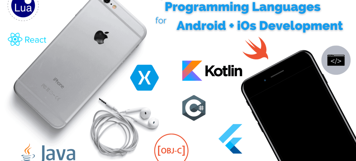
This trend also enlightens the significance of using the right frameworks and programming languages for Android and iOS apps. Indeed, businesses and developers must choose the best programming technologies for building mobile apps to maximize user experience.
Several dev tools and languages are available here, but it is essential to know which scripting technology is suitable for your project.
So, this article is going to discuss the best programming languages for Android and iOS in detail, including their pros and limitations.
App development technologies are constantly advancing. Especially the use of cloud computing platforms has become crucial for developers and companies to fulfill their development needs. AWS Amplify and Firebase are big names for backend development hereof.
However, most businesses and dev teams want to compare these Amazon and Google-backed CSPs to choose an appropriate option for their project.
So, this article is going to discuss the key differences between Amplify and Firebase in detail. We will also analyze the core functionalities of these Backend as a Service (BaaS) platforms.


