It’s time for a new look for back4app. Modern, professional, and more connected to you.
Since 2015, our mission at back4app has been to make it easier for web and mobile app developers to succeed. From startups to enterprises, we have worked closely with each of our customers, gaining a deep understanding of their challenges and providing unique expert solutions to help them reach their goals.
The company evolved a lot. We’ve helped more than a thousand companies and more than 190,000 developers become more productive and quickly deliver apps.
Like the company, we decided that the brand should also evolve to reflect the maturity and professionalism achieved, to be at the top of our game today and for what’s still to come.
Today we’re incredibly excited to reveal back4app’s new visual identity!
New logo
A brand for us reflects what a company stands for. It’s an externalization of the company values and beliefs. It represents who you are and why you do what you do.
Making it easier for developers to succeed by building software products is our mission and is about making the whole process simpler and more efficient. Therefore, most customers today recognize back4app as a simple and easy-to-use platform. So, we found no better way to reflect that than using a super-simplified lowercase written logo.
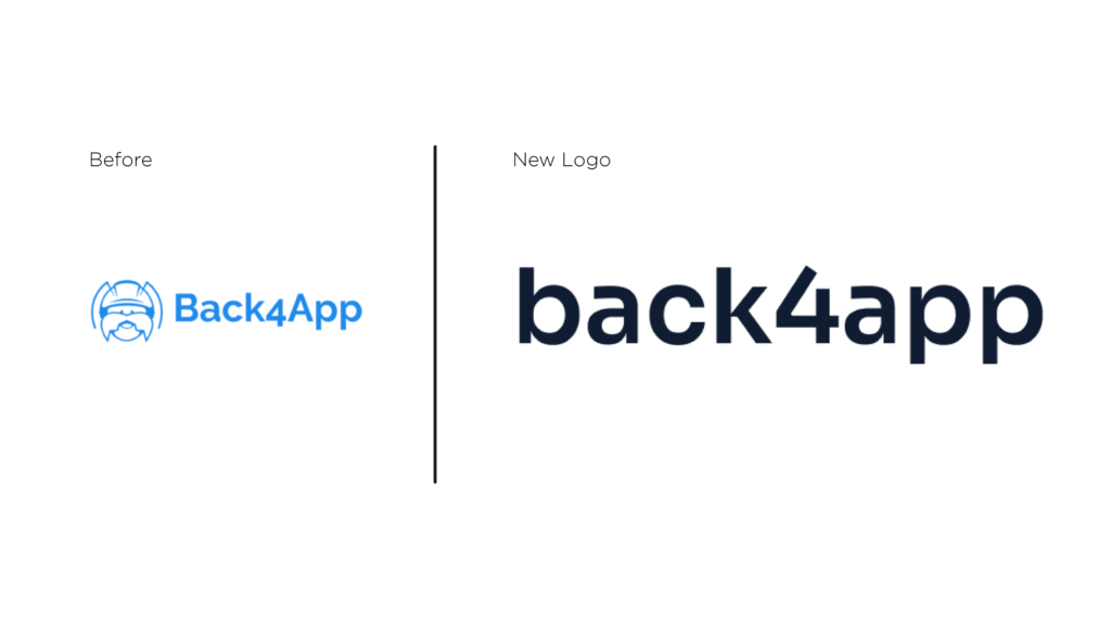
This change reflects how robust and simple back4app is. The strong impact of the lowercase written logo sounds like a “stamp”, and it brings quality and simplicity to use and start. An all-type logotype solution reflects a brand that works for our clients, constantly adapting to the future, whatever the shape of our design is.
The logos are available for download here.
New visual identity
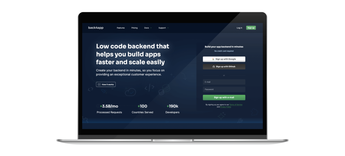
After talking to some users, we’ve noted that our visual identity and communication did not reflect how solid, robust, and professional back4app is.
There’s no better color to represent these attributes than the black color, which translates to how important our users are to us. We decided to migrate back4app visual identity to an entire dark theme inspired by dark mode screens that developers use to work to get more comfortable and save more energy, by the way.
The colors’ balance and minimalist design give focus on the main points to help our users identify the right journey to start developing with back4app. The lights’ effects reflect the gain: a fast solution to save the developers time and make the ideas shine.
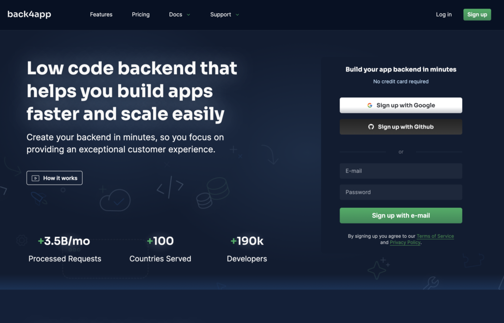
We’ve also improved the communication to better explain how solid and robust back4app is.
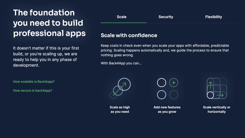
With this evolution, you can be confident in our commitment to helping you build modern and professional apps faster. Welcome to your new home, and know that here at back4app, it’s always day one. The good times are only getting started for both of us. Keep an eye on our blog and newsletters for updates!


