React Native Text Input
The TextInput is one of the main components of the React Native Core library, and also one of the most commonly used in many apps. This simple component is so fundamental in any application design that there are possibly only a few applications not using it. In this article, we are going to cover the most common use cases, input masking, and basic troubleshooting. If you want to know more about one of the most used components from React Native check this article out!
Contents
Code Overview
Although the first examples are basic snippets focusing on TextInput instantiation, our final sample covers the Form use case and includes additional components styling and layout. Let’s start with simple snippets to show you the TextInput instantiation. This case examines the component in a common Form scenario where we can set up a configuration like this:
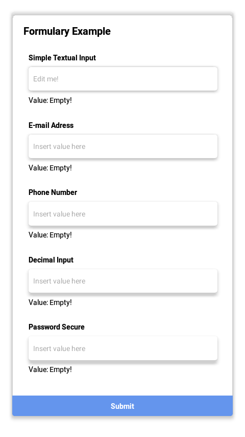
To achieve this Form with a styled layout we are using the library [6] styled-components and implementing a basic component layout structure with a simple logic to render an array of fields in that formulary. You can check out the full source code at the end of the article!
Use Cases
This section will explore the most common use cases for TextInput that require minimal configuration, such as the keyboard layout.
Textual Input
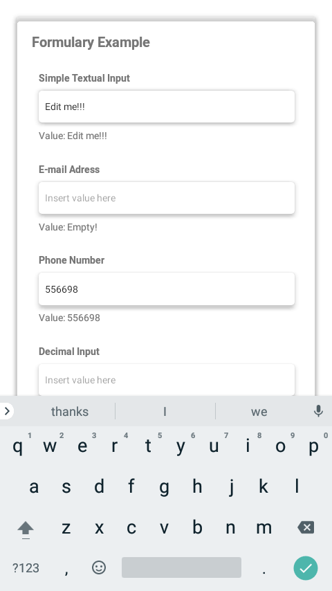
Maybe this is the simplest and most common use case for TextInput. In many cases, most developers are looking for pure textual input when implementing a basic form layout for a scene before entering the tricky part of the job for that scene. This use case doesn’t require further configuration and is implemented, as shown in the example below:
Mail adress and URL input
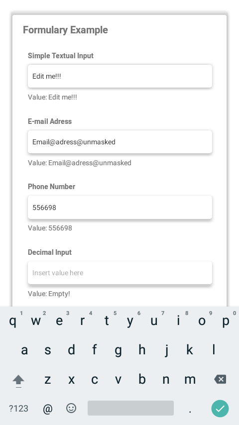
Although the simple, pure textual input covers most use cases, you may need a different kind of textual input such as URL, email, or phone. The TextInput component implementation for this use case requires a keyboardType property simple configuration to use the email-address value (a cross-platform option). You can also define a specific URL, Twitter Input, web-search (valid only for iOS). Let’s check how to use those configuration options:
Although the simple, pure textual input covers most use cases, you may need a different kind of textual input such as URL, email, or phone. The TextInput component implementation for this use case requires a keyboardType property simple configuration to use the email-address value (a cross-platform option). You can also define a specific URL, Twitter, web-search (valid only for iOS). Let’s check how to use those configuration options:
 <TextInput
    keyboardType="email-address"
    onChangeText={setText}
    defaultValue={text}
  />
Phone number input
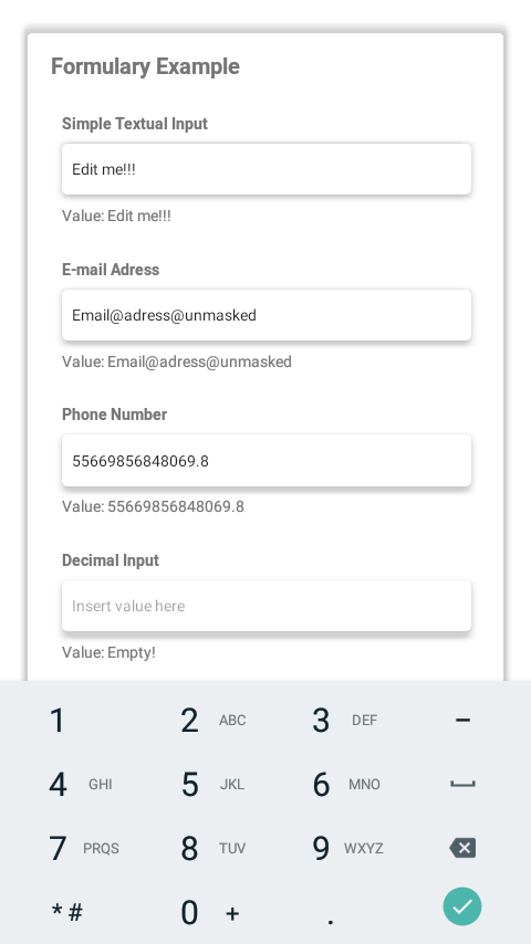
Suppose you need to implement a use case that enables the user to insert phone numbers the TextInput. In that case, the keyboardType property is defined as phone-pad (which is a cross-platform option that will work in both Android and iOS) or name-phone-pad, which is an iOS specific option:
<TextInput
    keyboardType="phone-pad"
    onChangeText={setText}
    defaultValue={text}
  />
Weights, quantities input
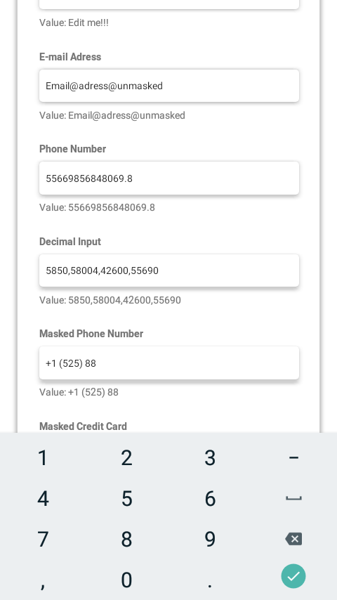
For even different scenarios where the user may need to directly insert values such as weights, distances, and quantities (commonly used in e-commerce applications), the developer needs to configure the TextInput keyboard for decimal values input.
This feature covers different use cases as there are different types of numeric input such as weight, distance, and quantities inputs. The TextInput must be configured with the keyboardType property defined to one of the decimal-pad, cross-platform numeric values or numbers-and-punctuation(iOS specific values):
 <TextInput
    keyboardType="decimal-pad"
    onChangeText={setText}
    defaultValue={text}
  />
Passwords
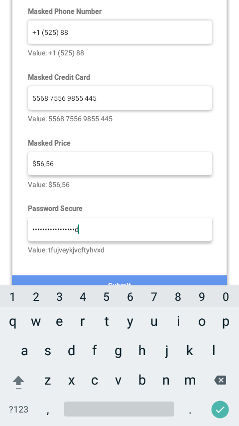
The secure textual input is used on many applications that have a Sign-Up/Sign-In feature implemented. The solution here is to use the secure text input, which will hide it’s content while the user interacts with the component.
To enable the hidden content TextInput, the developer must enable the property secureTextEntry on the TextInput component. In some cases, you need to implement the feature with a way to toggle between secure and insecure text, as shown in the example:
Advanced Usage
Controlled input
Now that we know how to instance a basic version of TextInput with a custom keyboard configuration, it may be interesting to learn how to control that input. That allows you to modify TextInput content as the user types. Let’s start by changing the defaultValue property to value prop and applying some text processing on the text setter:
In this example, the TextInput setter processing replaces all numbers with the character X. This is the primary method used by many TextInput masks technologies. I also recommend using third-party libraries that implement masking so you can save time while using a recommended way to implement masking professionally.
Masks
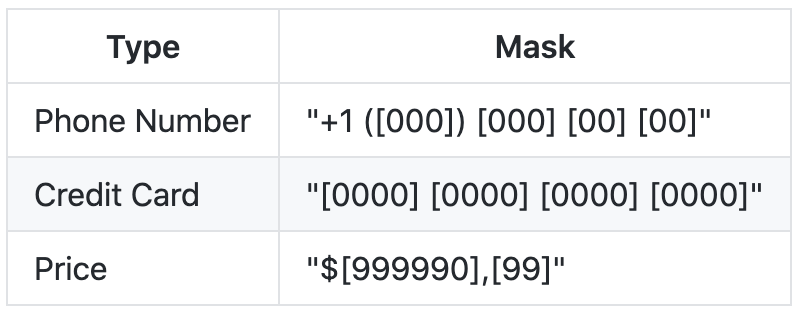
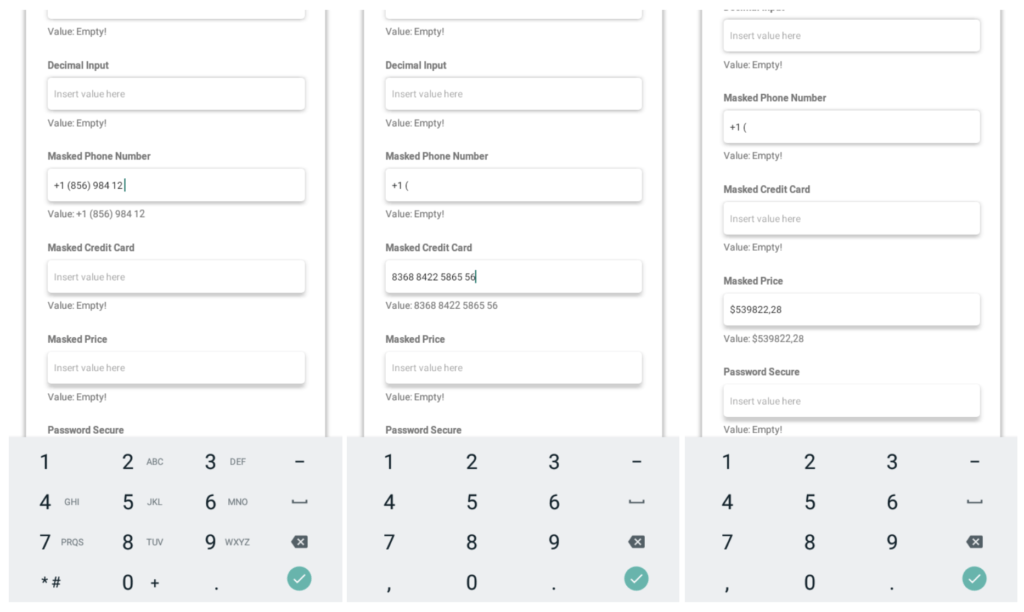
TextInput masks are an essential resource when building a form/input screen on your App. I recommend you not to reinvent the wheel and use a third-party library such as react-native-text-input-mask.
This lib has the mask feature already implemented and is easy to use. You can set up a simple mask string that describes the mask’s desired text format. The most basic way to use is in the example as follows:
import TextInputMask from 'react-native-text-input-mask';

<TextInputMask
  mask={"+1 ([000]) [000] [00] [00]"}
  onChangeText={(formatted, extracted) => console.log(formatted, extracted)}
/>
The mask used in the example above is commonly used for phone inputs:
Troubleshooting
Flickering
The flickering bug may occur when using controlled TextInput (the type of component that receives the prop value directly) and mishandling the user input in some way, such as in cases where user input does not affect the input value. From the React Native Dev pages:
Value prop: For most uses, this works great, but in some cases, it may cause flickering – one common cause is preventing edits by keeping value the same. In addition to setting the same value, either set editable={false}, or set/update maxLength to prevent unwanted edits without flicker.
maxLength prop: Limits the maximum number of characters that can be entered. Use this instead of implementing the logic in JS to avoid flicker.
To resolve flickering problems, the developer must pay attention to these lines on the documentation and try to debug whether the input value setters are messing with the component internal value state.
Rerendering
When using the controlled state TextInput, you may note that the other components that are together with the input components are not rerendering. It may be caused by undesired value setters in the component structure. To solve this issue, try to debug the setters and test whether useMemo or useCallback may resolve your issue.
Source Code
References
Below are all reference documentation used to write this article:
- https://callstack.github.io/react-native-paper/text-input.html
- https://reactnative.dev/docs/textinput
- https://reactnative.dev/docs/handling-text-input
- https://lefkowitz.me/visual-guide-to-react-native-textinput-keyboardtype-options/
- https://github.com/react-native-text-input-mask/react-native-text-input-mask
- https://www.npmjs.com/package/styled-components
Attributions
Mock smartphone image created by wayhomestudio – br.freepik.com


