Instagram Clone App using SwiftUI and GraphQL – HomeView

Today in part 4 of our Instagram clone App with GraphQL we will continue learning some SwiftUI, building our Home view.
In our previous articles, we learned how to sign up a user and how to log in a user and created the Profile view with the respective UIs in our Instagram clone App. Today we will reuse some of that code and create something similar to a UIScrollView with lots of content.
Fast your seat belts and let’s get it going!
For better learning, download the iOS Instagram Clone project with source code.
Contents
- 1 Do you want a quick start?
- 2 What exactly we will be building
- 3 Our UI components
- 4 Top Bar
- 5 History Bar
- 6 Bottom Bar
- 7 Adding some Complexity
- 8 Conclusion
- 9 Reference
- 10 What will be the key in building Instagram Clone App home view?
- 11 What is the use of GeometryReader?
- 12 Is it worth it to Build Instagram Clones with SwiftUI?
Do you want a quick start?
Clone this App from our Hub and start using it without any hassles!
What exactly we will be building
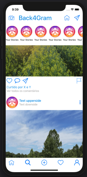
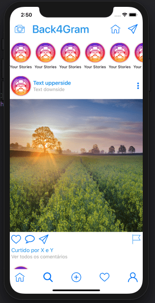
We will be building the following view:
As we saw earlier, SwiftUI makes it really easy to build such complex interfaces as you can reuse a lot of components very easily. The word here is “reuse”.
Remember we already coded that bottom bar? We will reuse it for this. Everything else is new.
I will not be going over VStacks and HStacks again, so if you missed that part, check it back here.
Our UI components
This screen will be composed basically of four components:
- The top bar (with the camera, Back4Gram string, house icon, and paper plane icon)
- History bar (with the icons for histories)
- Timeline Detailed view (with the actual posts)
- Bottom bar (that we will be reusing)
Let’s start building those!
Top Bar
The top bar is composed of five components:
- Camera button
- Back4Gram string
- Spacer
- House button
- Paper plane button
Add the icons for the buttons as you’ve already learned, and let’s start coding.
Create your HomeView.swift file and let’s add a GeometryReader so we can resize everything nicely:
And just as the previous tutorial, let’s add a VStack because everything will be shown in a vertical axis:
Our top bar will be a conjunction of components aligned horizontally, so let’s add the HStack to create it:
And finally add the controls we will be using:
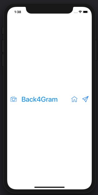
How does it look?
We are going places!
Now let’s discuss a bit about the
History Bar
The history bar is itself a complex component. It is just like a UIScrollView from the old UIKit, but inside it, we have a control composed by an image and a text below it (a.k.a. VStack). Let’s create that structure:
Putting that into our main VStack is as easy as adding the ScrollView. And to make it nicer, let’s make it only scroll horizontally and hide the scroll indicators:
and finally add it to our main VStack:
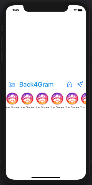
Checking the looks:
Now, let’s jump ahead and add first our…
Bottom Bar
Now let’s enjoy all that reusability. Just add it from our BottomBar.swift file into our code:
And our full code:
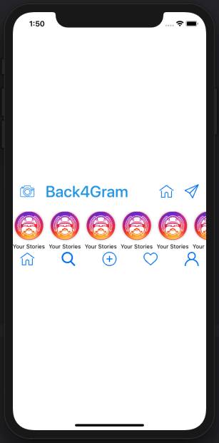
Wasn’t that easy? How does it look?
Sweeft!
Adding some Complexity
Our most complex part of this View will be the Timeline Detailed view.
To keep it consistent with what we did in our TimelineView, let’s create a new file named TimlineDetailView.swift and in there create a new struct that will hold the data just like in our TimelineView.
Remember we already have our Preview struct declared in our TimelineView, so let’s reuse that as well.
The Struct will receive a Preview so we can retrieve the imageUrl later:
And with that done, let’s add the view itself:
The main content will also be in a VStack:
And that VStack will have four components:
- A HStack with the logo, texts and three dots button
- The Image of the post
- A Hstack with the heart button, comment button, paper plane button and flag button
- A VStack containing the texts “Liked by..” and “See all comments””
So let’s start by adding the first HStack:
And adding the controls inside it:
Then the Image:
Our second HStack with all the buttons:
And its controls:
And last but not least our texts VStack:
Now, inside our TimelineDetailView, let’s hardcode a few Previews:
And finally loop through adding our PreviewDetailViews to a ScrollView:
Finally, let’s add that to our HomeView:
Finally, let’s see the results:
How cool is that!
Conclusion
Reusability is key in SwiftUI.
Today you learned how to reuse the BottomView and the Preview struct from our previous articles.
It is time for some functionality and I can barely wait for it.
Stay tuned!
Reference
- Part 1 of this series is Instagram Clone App.
- Part 2 is Swift Instagram Clone.
- Part 3 is Instagram Profile.
- Part 4 is Instagram Homeview.
- Download an iOS Instagram Clone project with source code and start using Back4App.
Sign Up now to Back4App and start to build your Instagram Clone App.
What will be the key in building Instagram Clone App home view?
The key will always remain reusability. We will reuse components to develop the home view of Instagram apps. Reusability is the key factor of SwiftUI.
What is the use of GeometryReader?
While developing the clone, after adding the buttons etc this is the first step of coding. We need to create a HomeView.swift file and add GeometryReader in it. It will help to resize each and everything in a nice way.
Is it worth it to Build Instagram Clones with SwiftUI?
Yes, it’s totally worth it. It was a great swift experience. We built the clone in a very flexible way. We used some components again. Reusability and alignment of components and proper to the point coding made it happen. So, SwiftUI is totally recommended.
