An Instagram clone using SwiftUI and GraphQL – ProfileView

Today in part 3 of our Instagram clone App with GraphQL we will get deeper into SwiftUI, building our Profile view.
We will learn to reuse structs in SwiftUI and discuss a few controls: VStack, HStack, GeometryReader, Text, Button, Spacer, Image, Divider among others.
In our previous articles, we learned how to sign up a user and how to log in a user, with the respective UIs in our Instagram clone App. Today we will make it much nicer.
Fast your seat belts and let’s get it going!
For better learning, download the iOS Instagram Clone project with source code.
Contents
- 1 Do you want a quick start?
- 2 What exactly we will be building
- 3 HStack, Vstack, Zstack what?
- 4 Reusability
- 5 Creating our Profile View
- 6 Second HStack
- 7 Adding our Edit Profile Button and Divider
- 8 Mocking our Timeline
- 9 Bottom View
- 10
- 11 And Finally…
- 12 Conclusion
- 13 Reference
- 14 What is the plus point of SwiftUI?
- 15 What is Hstack, Vstack and Zstack?
- 16 What is the best feature of SwiftUI?
Do you want a quick start?
Clone this App from our Hub and start using it without any hassles!
What exactly we will be building
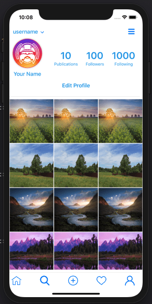
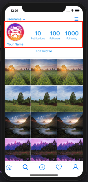
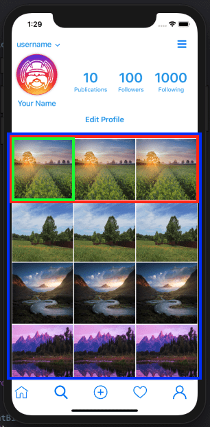
We will be building the following view:
SwiftUI makes it really easy to build such complex interfaces as you can reuse a lot of components very easily and straightforward.
The only thing is that we must learn how to create those reusable components. That one view is actually a combination of multiple views that integrate into one final result.
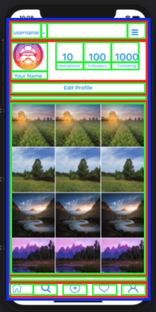
A simplified list of components is as follow:
Where:
- VStack
- Hstack
- Actual controls (buttons, dividers, etc)
HStack, Vstack, Zstack what?
SwiftUI builds its UIs by aligning views vertically by using VStack (Vertical Stack) and horizontally by using HStack (Horizontal Stack) and overlaying views with Zstack (Z as in z-index).
Every time you need one view under another one, you should use a VStack.
Every time you need one view alongside another one, you should use a HStack.
Every time you need one view overlaying another one, you should use a ZStack.
As our main view will consist of many views one horizontally placed under the other, we will contain everything into the main VStack and start from there, but there is one more that we will need to use in order to occupy the whole screen: the GeometryReader.
It allows us to render everything as a function of its (GeometryReader’s) size and coordinates.
Reusability
Reusability is one of the beauties of SwiftUI, so we can create complex controls and reuse them anywhere needed.
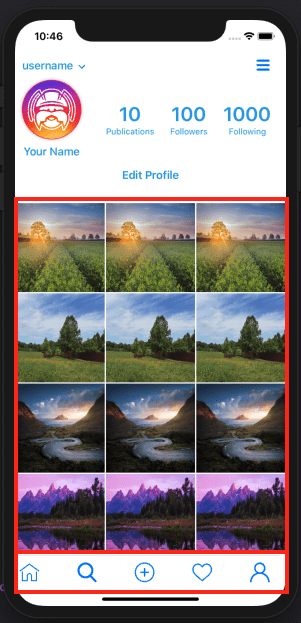
For this App, there are mainly two components that we will be reusing in different views: the Timeline and the bottom bar:
For this reason, we will create those UI codes separately so it gets more organized. All the other UI code specific for a view can stay into that view’s code file.
So let’s start…
Creating our Profile View
Add a new SwiftUI file and name it ProfileView.swift.
As we will be alining components to fill up the screen, let’s start adding a GeometryReader so we can assure all controls inside it will use its size and coordinates:
struct ProfileView: View {
    var body: some View {
        GeometryReader { geometry in

        }
    }
}
Now, our view will be built into a main VStack that will contain all our controls, so let’s add that as well
struct ProfileView: View {
    var body: some View {
        GeometryReader { geometry in
            VStack{

            }
        }
    }
}
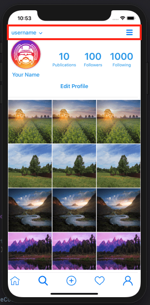
And our very first “line” of controls will be the top one:
What looks like a simple line of controls is actually multiple controls:
- the “username” text
- the small arrow pointing down next to it
- a Spacer to fill up the space between that small arrow and the next control
- a Hamburger button on the right
We will be using icons for the buttons, so be sure to find some free icons. A good place to find those is Freepik.
So, let’s add our HStack:
struct ProfileView: View {
    var body: some View {
        GeometryReader { geometry in
            VStack{
                HStack{

                }
            }
        }
    }
}
And in it, our first Text:
struct ProfileView: View {
    var body: some View {
        GeometryReader { geometry in
            VStack{
                HStack{
                    Text("username")
                }
            }
        }
    }
}
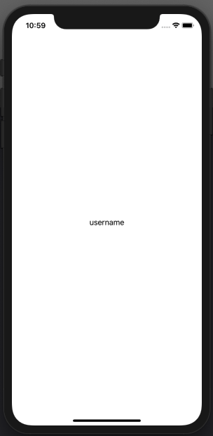
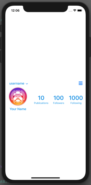
So far that probably brought you to this:
All right. It’s a start.
Let’s align it to the left side by adding a
(alignment: .leading)
code to our VStack:
struct ProfileView: View {
    var body: some View {
        GeometryReader { geometry in
            VStack(alignment: .leading){
                HStack{
                    Text("username")
                }
            }
        }
    }
}
We can also add some Text properties to make it more consistent with our design:
To set its color to our lightBlueColor which is defined in our AppDelegate:
.foregroundColor(lightBlueColor)
To change the font weight:
.fontWeight(.semibold)
And finally to add some padding (space) in the leading side:
.padding(.leading, 10)
And your code should now look like this:
struct ProfileView: View {
    var body: some View {
        GeometryReader { geometry in
            VStack(alignment: .leading){
                HStack{
                    Text("username")
                    .foregroundColor(lightBlueColor)
                    .fontWeight(.semibold)
                    .padding(.leading, 10)
                }
            }
        }
    }
}
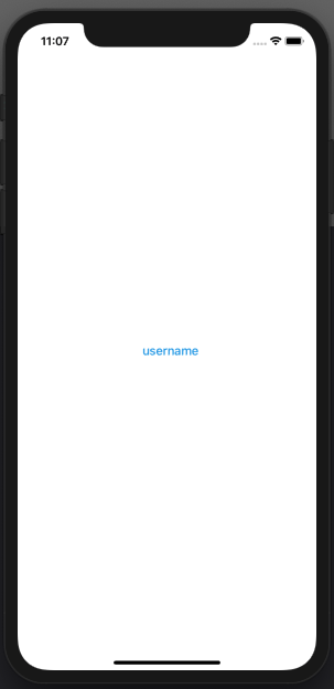
And your UI should look like this:
Now let’s add that little arrow button.
As you learned in Part 2 of this article, add the image for the arrow down for our button, and let’s add the button to our SwiftUI code:
Button(action: {}){

}
And add our Image into it:
Button(action: {}){
    Image("arrow-down")
    .resizable()
    .frame(width: 10, height: 10)
}
And just for alingment, let’s add some padding on the top:
Button(action: {}){
    Image("arrow-down")
    .resizable()
    .frame(width: 10, height: 10)
}
.padding(.top, 5)
Our full code should now be like this:
struct ProfileView: View {
    var body: some View {
        GeometryReader { geometry in
            VStack(alignment: .leading){
                HStack{
                    Text("username")
                    .foregroundColor(lightBlueColor)
                    .fontWeight(.semibold)
                    .padding(.leading, 10)

                    Button(action: {}){
                        Image("arrow-down")
                        .resizable()
                        .frame(width: 10, height: 10)
                    }
                    .padding(.top, 5)
                }
            }
        }
    }
}
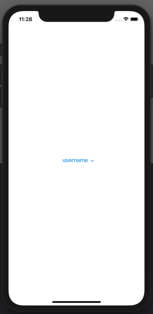
And our UI:
Now let’s add that hamburger button the same way:
Button(action: {}){
    Image("menu")
    .resizable()
    .frame(width: 20, height: 20)
}.padding()
Our full code:
struct ProfileView: View {
    var body: some View {
        GeometryReader { geometry in
            VStack(alignment: .leading){
                HStack{
                    Text("username")
                    .foregroundColor(lightBlueColor)
                    .fontWeight(.semibold)
                    .padding(.leading, 10)

                    Button(action: {}){
                        Image("arrow-down")
                        .resizable()
                        .frame(width: 10, height: 10)
                    }
                    .padding(.top, 5)

                    Button(action: {}){
                        Image("menu")
                        .resizable()
                        .frame(width: 20, height: 20)
                    }.padding()
                }
            }
        }
    }
}
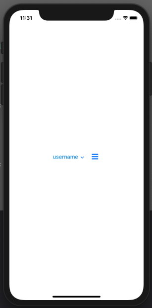
And our view:
If only there was something that we could put between those two buttons to take all the space between them and align everything…
Spacer()
Now it looks good!
Our full code so far:
struct ProfileView: View {
    var body: some View {
        GeometryReader { geometry in
            VStack(alignment: .leading){
                HStack{
                    Text("username")
                    .foregroundColor(lightBlueColor)
                    .fontWeight(.semibold)
                    .padding(.leading, 10)

                    Button(action: {}){
                        Image("arrow-down")
                        .resizable()
                        .frame(width: 10, height: 10)
                    }
                    .padding(.top, 5)

                    Spacer()

                    Button(action: {}){
                        Image("menu")
                        .resizable()
                        .frame(width: 20, height: 20)
                    }.padding()
                }
            }
        }
    }
}
And now let’s just fix the height of that HStack and give it some padding on the leading side, and we are good to go:
.frame(height: 50)
.padding(.leading, 10)
Full code:
struct ProfileView: View {
    var body: some View {
        GeometryReader { geometry in
            VStack(alignment: .leading){
                HStack{
                    Text("username")
                    .foregroundColor(lightBlueColor)
                    .fontWeight(.semibold)
                    .padding(.leading, 10)

                    Button(action: {}){
                        Image("arrow-down")
                        .resizable()
                        .frame(width: 10, height: 10)
                    }
                    .padding(.top, 5)

                    Spacer()

                    Button(action: {}){
                        Image("menu")
                        .resizable()
                        .frame(width: 20, height: 20)
                    }.padding()
                }.frame(height: 50)
                .padding(.leading, 10)
            }
        }
    }
}
Now we can start our…
Second HStack
As we created everything inside a main VStack, every new control we add outside of that first HStack will be automatically put under it.
So it is time to do our second HStack and build the second part of our screen:
This will also be a HStack, containing 4 VStacks inside: one for the Image and text below it, and 3 for the numbers with text under them.
As you probably got the concept by now, I’ll let the full code for this new HStack:
HStack{
    VStack{
        Image("logo-social")
        .resizable()
        .frame(width: 90, height: 90)
            .clipShape(Circle())
            .shadow(radius: 3)
            .overlay(Circle().stroke(Color.pink, lineWidth: 1))

        Text("Your Name")
            .foregroundColor(lightBlueColor)
            .fontWeight(.semibold)
    }.padding(.leading, 10)

    VStack{
        Text("10")
        .font(.system(size: 30))
        .foregroundColor(lightBlueColor)
        .fontWeight(.bold)

        Text("Publications")
        .font(.system(size: 13))
        .foregroundColor(lightBlueColor)
    }.padding(.leading, 30)

    VStack{
        Text("100")
        .font(.system(size: 30))
        .foregroundColor(lightBlueColor)
        .fontWeight(.bold)

        Text("Followers")
        .font(.system(size: 13))
        .foregroundColor(lightBlueColor)
    }.padding()

    VStack{
        Text("1000")
        .font(.system(size: 30))
        .foregroundColor(lightBlueColor)
        .fontWeight(.bold)

        Text("Following")
        .font(.system(size: 13))
        .foregroundColor(lightBlueColor)
    }

}.frame(height: 100)
.padding(.leading, 10)
And our full code would be:
struct ProfileView: View {
    var body: some View {
        GeometryReader { geometry in
            VStack(alignment: .leading){
                HStack{
                    Text("username")
                    .foregroundColor(lightBlueColor)
                        .fontWeight(.semibold)
                        .padding(.leading, 10)

                    Button(action: {}){
                        Image("arrow-down")
                        .resizable()
                        .frame(width: 10, height: 10)
                    }
                    .padding(.top, 5)

                    Spacer()

                    Button(action: {}){
                        Image("menu")
                        .resizable()
                        .frame(width: 20, height: 20)
                    }.padding()

                }.frame(height: 50)
                .padding(.leading, 10)

                HStack{
                    VStack{
                        Image("logo-social")
                        .resizable()
                        .frame(width: 90, height: 90)
                            .clipShape(Circle())
                            .shadow(radius: 3)
                            .overlay(Circle().stroke(Color.pink, lineWidth: 1))

                        Text("Your Name")
                            .foregroundColor(lightBlueColor)
                            .fontWeight(.semibold)
                    }.padding(.leading, 10)

                    VStack{
                        Text("10")
                        .font(.system(size: 30))
                        .foregroundColor(lightBlueColor)
                        .fontWeight(.bold)

                        Text("Publications")
                        .font(.system(size: 13))
                        .foregroundColor(lightBlueColor)
                    }.padding(.leading, 30)

                    VStack{
                        Text("100")
                        .font(.system(size: 30))
                        .foregroundColor(lightBlueColor)
                        .fontWeight(.bold)

                        Text("Followers")
                        .font(.system(size: 13))
                        .foregroundColor(lightBlueColor)
                    }.padding()

                    VStack{
                        Text("1000")
                        .font(.system(size: 30))
                        .foregroundColor(lightBlueColor)
                        .fontWeight(.bold)

                        Text("Following")
                        .font(.system(size: 13))
                        .foregroundColor(lightBlueColor)
                    }

                }.frame(height: 100)
                .padding(.leading, 10)
            }
        }
    }
}
So our view will look like this:
Neat!
Adding our Edit Profile Button and Divider
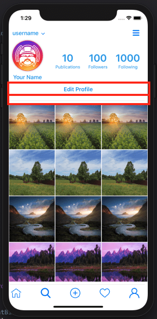
One would be tempted to think that the Edit Profile button and the Divider below it should be in a VStack:
But that is not really necessary as our whole View is inside our main VStack, so we can just add them to our code:
 Button(action: {}){
    Text("Edit Profile")
    .fontWeight(.bold)
    .foregroundColor(lightBlueColor)
}.frame(width: 400)
.padding()

Divider()
that would look like this:
struct ProfileView: View {
    var body: some View {
        GeometryReader { geometry in
            VStack(alignment: .leading){
                HStack{
                    Text("username")
                    .foregroundColor(lightBlueColor)
                        .fontWeight(.semibold)
                        .padding(.leading, 10)

                    Button(action: {}){
                        Image("arrow-down")
                        .resizable()
                        .frame(width: 10, height: 10)
                    }
                    .padding(.top, 5)

                    Spacer()

                    Button(action: {}){
                        Image("menu")
                        .resizable()
                        .frame(width: 20, height: 20)
                    }.padding()

                }.frame(height: 50)
                .padding(.leading, 10)

                HStack{
                    VStack{
                        Image("logo-social")
                        .resizable()
                        .frame(width: 90, height: 90)
                            .clipShape(Circle())
                            .shadow(radius: 3)
                            .overlay(Circle().stroke(Color.pink, lineWidth: 1))

                        Text("Your Name")
                            .foregroundColor(lightBlueColor)
                            .fontWeight(.semibold)
                    }.padding(.leading, 10)

                    VStack{
                        Text("10")
                        .font(.system(size: 30))
                        .foregroundColor(lightBlueColor)
                        .fontWeight(.bold)

                        Text("Publications")
                        .font(.system(size: 13))
                        .foregroundColor(lightBlueColor)
                    }.padding(.leading, 30)

                    VStack{
                        Text("100")
                        .font(.system(size: 30))
                        .foregroundColor(lightBlueColor)
                        .fontWeight(.bold)

                        Text("Followers")
                        .font(.system(size: 13))
                        .foregroundColor(lightBlueColor)
                    }.padding()

                    VStack{
                        Text("1000")
                        .font(.system(size: 30))
                        .foregroundColor(lightBlueColor)
                        .fontWeight(.bold)

                        Text("Following")
                        .font(.system(size: 13))
                        .foregroundColor(lightBlueColor)
                    }

                }.frame(height: 100)
                .padding(.leading, 10)

                Button(action: {}){
                    Text("Edit Profile")
                    .fontWeight(.bold)
                    .foregroundColor(lightBlueColor)
                }.frame(width: 400)
                .padding()

                Divider()
            }
        }
    }
}
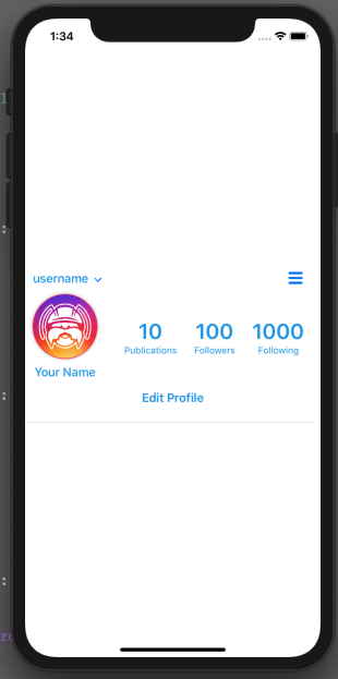
and our UI:
Mocking our Timeline
Our timeline view will be used in other parts of the application, so it makes sense to break it in a different file.
It could be reused from inside our ProfileView just as same, but it keeps things more organized when we split code.
Create a TimelineView.swift file.
There are many different ways to display data in SwiftUI, but I chose this one for my App:
- Our Timeline view is a VStack of LineViews
- Each LineView is a HStack composed by 3 PreviewViews
- Each PreviewView has a Image in it
First thing I’ll do is create a struct to hold our data. I’ll call that struct Preview and it will have 2 parameters: an id (type Int) to iterate and an imageURL (type String) that will hold the URL for an Image that I’ll be passing:
struct Preview {
    var id: Int
    let imageUrl: String
}
As I said, you could choose another way to display your data, but I found this very easy to understand, so let’s add the struct for our PreviewView first.
Our struct has a Preview property where I’ll set later, but will use the imageURL property to render the image:
struct PreviewView: View {
    let preview: Preview

    var body: some View {
        Image(preview.imageUrl)
        .resizable()
        .frame(width: 136, height: 136)
    }
}
with that done, we can add the struct for our LineView, which receives an array of 3 Previews to display in the line.
I’ll be changing that in the future to reflect real data, but for now, it will be OK:
struct LineView: View {
    let previewArray:[Preview]

    var body: some View {
        HStack(spacing: 2){
            PreviewView(preview: previewArray[0])
            PreviewView(preview: previewArray[1])
            PreviewView(preview: previewArray[2])
        }
    }
}
Finally, we can create an Array of Preview objects that we will loop through:
let previews:[Preview] = [
    Preview(id: 0, imageUrl: "1"),
    Preview(id: 1, imageUrl: "2"),
    Preview(id: 2, imageUrl: "3"),
    Preview(id: 3, imageUrl: "4"),
    Preview(id: 4, imageUrl: "5"),
    Preview(id: 5, imageUrl: "6"),
    Preview(id: 6, imageUrl: "7"),
    Preview(id: 7, imageUrl: "8"),
    Preview(id: 8, imageUrl: "9"),
    Preview(id: 9, imageUrl: "10"),
    Preview(id: 10, imageUrl: "11"),
    Preview(id: 11, imageUrl: "12"),
    Preview(id: 12, imageUrl: "13")
]
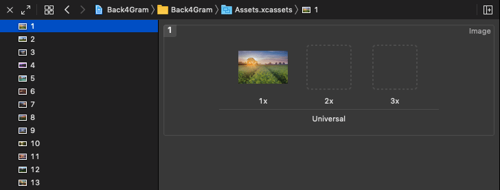
This Array has 13 objects and I referenced the images I’ll be using with names from 1 to 13. I also saved those images in my Assets folder, but again, I’ll be changing that in the future:
Now that we have everything done, we can iterate through our Array and create our LinePreviews by passing 3 preview objects to it.
Notice I am passing the same object, but once again, this is temporary for display and will be changed:
var body: some View {
        ScrollView{
            VStack(alignment: .leading, spacing: 2){
                ForEach(previews, id: \.id) { preview in
                    LineView(previewArray: [preview, preview, preview])
                }
            }
        }
}
So our full code would be something like this:
struct TimelineView: View {

    let previews:[Preview] = [
        Preview(id: 0, imageUrl: "1"),
        Preview(id: 1, imageUrl: "2"),
        Preview(id: 2, imageUrl: "3"),
        Preview(id: 3, imageUrl: "4"),
        Preview(id: 4, imageUrl: "5"),
        Preview(id: 5, imageUrl: "6"),
        Preview(id: 6, imageUrl: "7"),
        Preview(id: 7, imageUrl: "8"),
        Preview(id: 8, imageUrl: "9"),
        Preview(id: 9, imageUrl: "10"),
        Preview(id: 10, imageUrl: "11"),
        Preview(id: 11, imageUrl: "12"),
        Preview(id: 12, imageUrl: "13")
    ]

    var body: some View {
            ScrollView{
                VStack(alignment: .leading, spacing: 2){
                    ForEach(previews, id: \.id) { preview in
                        LineView(previewArray: [preview, preview, preview])
                    }
                }
            }
    }
}

struct TimelineView_Previews: PreviewProvider {
    static var previews: some View {
        TimelineView()
    }
}

struct Preview {
    var id: Int
    let imageUrl: String
}

struct LineView: View {
    let previewArray:[Preview]

    var body: some View {
        HStack(spacing: 2){
            PreviewView(preview: previewArray[0])
            PreviewView(preview: previewArray[1])
            PreviewView(preview: previewArray[2])
        }
    }
}

struct PreviewView: View {

    let preview: Preview

    var body: some View {
        Image(preview.imageUrl)
        .resizable()
        .frame(width: 136, height: 136)
    }
}
And if we call it from our ProfileView.swift right under our Divider:
...
 Button(action: {}){
    Text("Edit Profile")
    .fontWeight(.bold)
    .foregroundColor(lightBlueColor)
}.frame(width: 400)
.padding()

Divider()

TimelineView().padding(.leading, 10)

...
We can also add another Divider right under it so we have almost the final result we want:
...
 Button(action: {}){
    Text("Edit Profile")
    .fontWeight(.bold)
    .foregroundColor(lightBlueColor)
}.frame(width: 400)
.padding()

Divider()

TimelineView().padding(.leading, 10)

Divider()

...
How does it look?
Does it look nice already?
Let’s finish it by adding our…
Bottom View
The bottom view will be yet another file, as we will use it in multiple parts of the application.
Create your BottomView.swift file and in it create an HStack (as buttons will be side by side) of 4 buttons with Spacers among them. Don’t forget the icons!
struct BottomView: View {
    var body: some View {
        HStack{
             Button(action: {}){
                 Image("home")
                 .resizable()
                 .frame(width: 30, height: 30)
             }.padding()

             Spacer()

             Button(action: {}){
                 Image("search")
                 .resizable()
                 .frame(width: 30, height: 30)
             }.padding()

             Spacer()

             Button(action: {}){
                 Image("plus-button")
                 .resizable()
                 .frame(width: 30, height: 30)
             }.padding()

             Spacer()

             Button(action: {}){
                 Image("heart")
                 .resizable()
                 .frame(width: 30, height: 30)
             }.padding()

             Spacer()

             Button(action: {}){
                 Image("user")
                 .resizable()
                 .frame(width: 30, height: 30)
             }.padding()
        }.frame(height: 35)
    }
}
This was easy! Let’s integrate it into our ProfileView.swift, right below our last Divider:
...
Divider()

TimelineView().padding(.leading, 10)

Divider()

BottomView()
...
So our full code of ProfileView would be:
import SwiftUI

struct ProfileView: View {
    var body: some View {
        GeometryReader { geometry in
            VStack(alignment: .leading){
                HStack{
                    Text("username")
                    .foregroundColor(lightBlueColor)
                        .fontWeight(.semibold)
                        .padding(.leading, 10)

                    Button(action: {}){
                        Image("arrow-down")
                        .resizable()
                        .frame(width: 10, height: 10)
                    }
                    .padding(.top, 5)

                    Spacer()

                    Button(action: {}){
                        Image("menu")
                        .resizable()
                        .frame(width: 20, height: 20)
                    }.padding()

                }.frame(height: 50)
                .padding(.leading, 10)

                HStack{
                    VStack{
                        Image("logo-social")
                        .resizable()
                        .frame(width: 90, height: 90)
                            .clipShape(Circle())
                            .shadow(radius: 3)
                            .overlay(Circle().stroke(Color.pink, lineWidth: 1))

                        Text("Your Name")
                            .foregroundColor(lightBlueColor)
                            .fontWeight(.semibold)
                    }.padding(.leading, 10)

                    VStack{
                        Text("10")
                        .font(.system(size: 30))
                        .foregroundColor(lightBlueColor)
                        .fontWeight(.bold)

                        Text("Publications")
                        .font(.system(size: 13))
                        .foregroundColor(lightBlueColor)
                    }.padding(.leading, 30)

                    VStack{
                        Text("100")
                        .font(.system(size: 30))
                        .foregroundColor(lightBlueColor)
                        .fontWeight(.bold)

                        Text("Followers")
                        .font(.system(size: 13))
                        .foregroundColor(lightBlueColor)
                    }.padding()

                    VStack{
                        Text("1000")
                        .font(.system(size: 30))
                        .foregroundColor(lightBlueColor)
                        .fontWeight(.bold)

                        Text("Following")
                        .font(.system(size: 13))
                        .foregroundColor(lightBlueColor)
                    }

                }.frame(height: 100)
                .padding(.leading, 10)

                Button(action: {}){
                    Text("Edit Profile")
                    .fontWeight(.bold)
                    .foregroundColor(lightBlueColor)
                }.frame(width: 400)
                .padding()

                Divider()

                TimelineView().padding(.leading, 10)

                Divider()

                BottomView()
            }
        }
    }
}

struct ProfileView_Previews: PreviewProvider {
    static var previews: some View {
        ProfileView()
    }
}
And Finally…
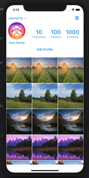
We have our full ProfileView:
Now, how awesome was that!
Conclusion
Today you learned how to mock a Profile View into your App. It is still just a mock, but we will give it some functionality over time.
You learned how to create and reuse components in SwiftUI and how beautifully use them to create a complex view. Awesome!
We will be creating a few other Views in the next article!
Stay tuned!
Reference
- Part 1 of this series is the article Instagram Clone.
- Part 2 is the article Swift Instagram Clone.
- Part 3 is the article Instagram Clone Profile.
- Part 4 is the article Insta Clone Homeview.
- Download an iOS Instagram Clone project with source code and start using Back4App.
Sign Up now to Back4App and start to build your Instagram Clone App.
What is the plus point of SwiftUI?
If you are looking to build clones such as Instagram app, SwiftUI will do its magic.
-It helps in building complex interfaces
-Re using of components
-The process to re-use interfaces is simple and easy
You should only have the knowledge to re-use those components together.
What is Hstack, Vstack and Zstack?
These names are connected because of US representation. SwiftUI builds its UIs with following patterns.
-UI is built vertically by using Vertical Stack
-It is built horizontally by using horizontal stack
-Overlapping views are built with ZStack
What is the best feature of SwiftUI?
The best feature of SwiftUI is reusability. You can re-use the components over and over again to build the views. It applies to all apps. You need to know how to play with these components.
